UX Observations: Behanced
Behance is such a pretty place to visit, the site is always tricked out with the latest in designer embellishments. But good design doesn’t always translate to good usability, which is something even the prettiest pixels have to learn the hard way.
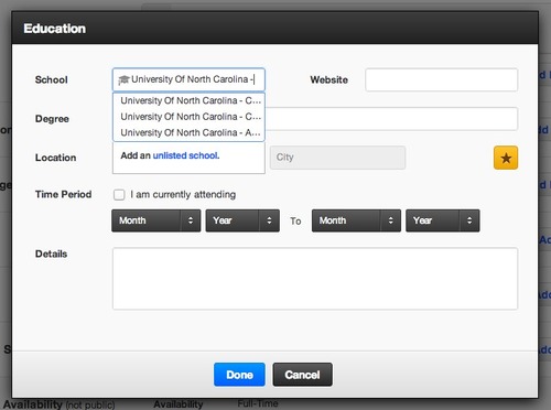
When I was filling out the little bit about where I went to school (GO HEELS!), the autocomplete was somewhat less than helpful. Firstly, I can’t see which UNC school they’re trying to suggest there (could be Chapel Hill or Charlotte), and secondly, when I did click to choose one of those options, the name of the school was too long for the input field, and I had to click inside of it and arrow over with the cursor.
Not a pretty picture. Both school and website input probably each need their own lines, because, again, what if my website is www.omgIcantbelieveImanagedtogetthisurl.com?