UX Observations: Mrs. Meyer's Button Miss
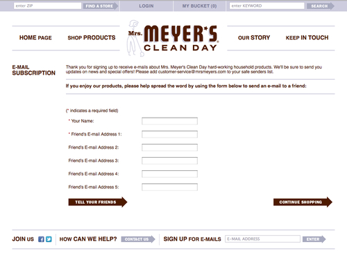
Don’t get me wrong, I love Mrs. Meyer’s products. I fork out the extra dough to have my counter tops smelling like Lemon Verbena, so I am not bagging on the brand. But when I signed up for their mailing list recently, they tried to entice me to spread the word to my friends, but the buttons at the bottom of the form were confusing.
Instead of the standard “Submit,” there’s custom copy that says “Tell Your Friends.” It also doesn’t look like the clickable button that it is, so it made for some confusion. Also, what if I want to tell my friends and continue shopping?
Remedy: Use a standard button with standard text (“Submit” or “Done” is just fine, thank you), and line up the button, centered, underneath the form fields. Get rid of the “Continue Shopping” button, and just allow people to use the top nav, since not everyone will be coming from the shopping experience.